UX in real life: Public navigation design
The importance of clear navigation. How one revolutionary solution has changed the world of design and the ways navigation becomes universal.
A few months ago I was in Vienna. That was my fifth time in this city and nothing should have gone wrong. But on my way back to the airport I had an unexpected situation.
I was at the large Wien Mitte station and started to look at where to buy the ticket to the airport. There was a pictogram in the navigation panel above — a white plane on the green background. That’s what I need!
I took this direction and soon realized it leads to a different transport line. The journey takes less time but the price is higher compared to the national carrier. That wasn’t what I planned and I decided to continue searching for my initial goal. Turned out, it wasn’t easy.
Luckily I was still on time at the airport, and so was my anxiety followed me. I asked myself—does that navigation have a green background on purpose to make you feel trust, or it was purely based on the brand color of this carrier? Why it was placed next to other essential navigation signs while clearly, it doesn’t tell you that’s only one of the options that bring you to the airport.
Thanks to this case I realized that clear navigation is an essential thing in our lives. And that’s where designers play a key role.
The beginning

I could pretend like I know that the first navigation signs in the shape of arrows appeared a long time ago in the caves. But, that’s just a random picture above and I want to come down, literally.
The underground story
We might not even think that the metro maps have ever looked a different way than today. Turned out, a century ago they were like this.


In the first example, the lines followed the real map of the city and thus, created the overlay and some areas were hard to read. The second version no longer had the streets and even got the upcoming stations marked. But the distances still followed the geographical positions and all the lines were curved.
And here comes a man with a brilliant mind. Straight lines and 45-degree angles, the distance between stations is no longer equivalent to geographical correlation—that’s the revolutionary London underground map concept made by HC Beck in 1933. Huuuurray!


In fact, the concept wasn’t accepted right from the beginning. Only after numerous testings, it proved it’s much easier to read and use compared to the previous ones. What’s interesting is that the same decade Piet Mondrian created his abstract paintings that brought a different perspective into art. Both “novelties” can be compared in terms of new people’s perception of the world around them. Simplicity and clarity became the new royals.
How to make navigation universal?
Mind the gap. Subway signs.
These days, apart from the smooth and clean map, the stations have a prominent info panel. From such design elements, we get the essential info on what lines or trains are going here. Usually, this data is presented with different colors as an instant, distinctive message.
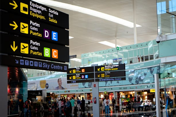
While it’s clear that the signs do look universal in English-as-the-first-language territories, other countries have to deal with double or even triple languages on their info billboards.
Luckily, there’s a way not to use more space and plastic but to put titles on different languages next to each other. Fantastic.
Airports.
In the following example from one of Bangkok’s airports, we see how 3 languages are combined. There’s a pictogram as a bigger and more prominent element, and the explanation follows.
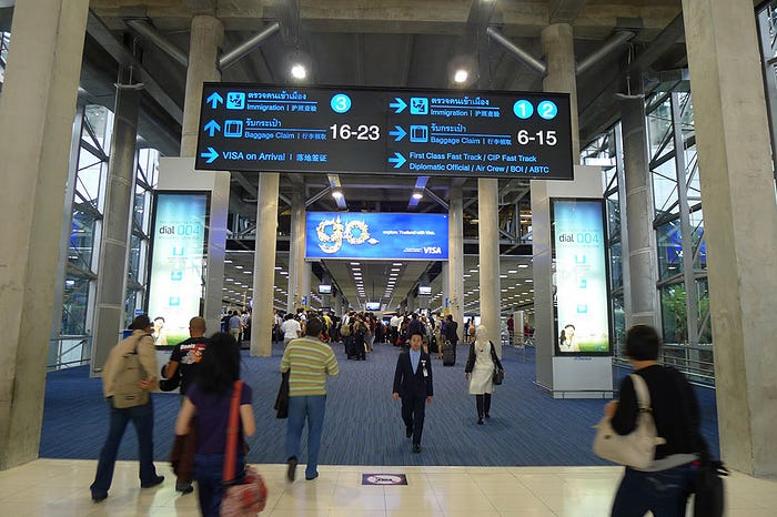
But this solution can be improved. How?
Once again, with the help of different colors. This way, once you focus on the familiar language you’ll know where exactly to look for the info on the next panel.
One more interesting example can be seen at Changi airport, Singapore.
Here, the division by color is used for primary and secondary signs. The primary is a more prominent and contrast yellow color—the color you might notice often in the info panels with the dark background. The secondary is less bright blue.
As for the second language, it is white and much reduced. I would say, it’s an arguable solution in this case as the text looks too small and not that accessible.


Small details. Accessibility.
Back to the case when there’s only one language on the info board, the structure can look better when several colors are applied. This way, the info is divided into graphic signs, titles, certain parameters (like time to reach the destination in Adelaide example below).
One more aspect to remember is the accessibility of info. Regardless of people’s abilities, everyone should be able to use navigation. This is where pilot versions help to analyze how people actually interact with the navigation board.

Gamification.
Wait, are we still talking about offline usability?
Yes, and here’s what I mean.
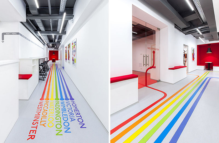
For the first time, I saw such a fun element in one of the Columbo tv series. Columbo himself was at the hospital and the health worker directed him to follow one of the colorful lines on the floor. Assuming it was filmed in between the 70s-80s, such navigation approach has been already existing for many decades.
The same approach can be seen in some airports or even on the streets. The thing to remember is that in case there are many people in the room, the lines will be harder to recognize. Also, a covering material means a lot as it has to be durable or be repainted from time to time.
What I’ve learned
Key points:
- Simplified schemes of maps are easy and quick for our perception.
- Color plays a huge role in navigation. It divides the directions and accentuates on the primary elements.
- Though pictogram is usually the most prominent element of the navigation, the additional text sometimes plays an important role too (like in my intro story).
- Accessibility is a must-have feature.
- A fun element like colorful navigation on the floor can enrich the usability and add positive emotions.
Every moment you’re on the street, especially in a new surroundings or in a different country, there are many aspects to pay attention to. As a UX/UI designer, I believe it’s important to analyze the real world and see what people are used to. How they interact with navigation.
The popular nowadays phrase “We’re all in this together” can present one more idea—we’re all people in the same space. And no matter where we are at the moment, in online or offline reality, we’re interested in a smooth interaction.
Credits:
Beyond the interface, a great article by Thomas Byttebier made me research more on the design processes of the London underground map.
Making Sydney more accessible, here you can find the detailed info on how the city got the new pedestrian navigation. Lots of images and schemes included.
You might also like:
UX/UI analysis of currency design, my fresh research on coins and banknotes design from all over the world.
The value of the city branding, what does the city identity bring to the locals and tourists.
Cultural specifics — how do they influence on design and user experience? , both travel diary about my time in Morocco and Sweden with UX notes.
